


























A practical cross-niche guide for small business owners, marketers, and founders who need brand communication to feel professional without becoming hard to read.
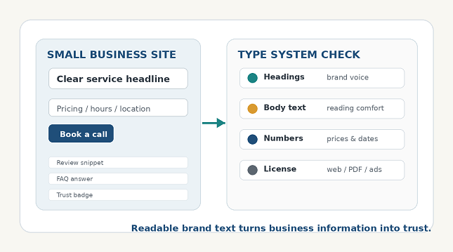
Original generated illustration: brand text, website structure, and type-system checks for a small business.
Small business growth often depends on how quickly people understand what a company does. A visitor lands on a website, reads a service page, checks prices, compares testimonials, downloads a PDF, or scans a pitch deck. Before they speak to the owner, the text has already shaped their level of trust.
For business blogs, founders, local service companies, ecommerce startups, consultants, agencies, and finance-focused teams, clear brand text is more than copywriting. It also depends on the type system behind the words. Fonts affect whether information feels organized, whether numbers are easy to compare, and whether a small company looks ready for serious customers.
This guide explains how small businesses can make websites, decks, proposals, and customer materials easier to read while keeping a distinctive brand voice. The goal is not to chase visual trends. The goal is to make information easier to trust.
Start with the business decision your reader needs to make
Every business page has a job. A home page should explain the offer quickly. A pricing page should remove uncertainty. A proposal should make scope and value easy to understand. A pitch deck should help investors follow the story without getting distracted by inconsistent design.
The font choice should support that decision. If a page helps customers compare service packages, clear numerals and labels matter more than dramatic style. If a founder is preparing a brand story slide, a stronger display style can help, but only if the supporting text remains readable.
| Business touchpoint | Reader question | Typography priority |
| Home page | What does this company do? | Clear headline, short subheads, readable body text |
| Service page | Is this offer relevant to me? | Strong hierarchy, scannable sections, plain labels |
| Pricing page | What will it cost? | Reliable numerals, visible comparisons, clean tables |
| Pitch deck | Can I follow the business story? | Readable slides, consistent headings, restrained accents |
| Proposal or PDF | What is included and what happens next? | Clear sections, readable terms, visible action items |
| Customer portal | Where do I find invoices, orders, or support? | UI labels, clean forms, and predictable navigation |
Match font roles to business touchpoints
Small businesses often use one font everywhere because it feels simple. Others use too many fonts because every template, designer, or contractor adds a new style. A stronger approach is to define a small set of roles: headings, body text, labels, numbers, and accents.
This creates consistency without making the brand feel rigid. A restaurant, law office, finance consultant, ecommerce brand, or SaaS startup can all use the same principle: expressive type for recognition, readable type for decisions, and careful numeric styling for facts that customers must not misread.
| Type role | Best use | What to avoid |
| Display type | Hero headings, campaign lines, brand moments | Long service pages or dense pricing information |
| Text type | Articles, proposals, FAQs, descriptions | Making it so plain that the brand loses personality |
| UI type | Menus, forms, buttons, filters, portals | Decorative shapes in small sizes |
| Numeric style | Prices, dates, phone numbers, metrics | Ambiguous 1, I, 0, O, or 5 |
| Accent style | Badges, pull quotes, short labels | Using it everywhere until the page feels noisy |
Use commercial and custom fonts with a practical plan
Free fonts can work for early experiments, but commercial work needs more discipline. A small business may use the same typeface on a website, pitch deck, email signature, downloadable guide, sponsored post, social graphic, invoice, and printed brochure. That range makes quality and licensing important.
Commercial fonts often provide more weights, better spacing, clearer licensing, and stronger language support. Variable fonts can help responsive websites and flexible brand systems. Custom fonts become more useful when a company grows across many channels and needs a voice that competitors cannot easily copy.
Teams comparing professional font families, variable fonts, or custom typography options can review foundries such as TypeType when they need type systems that can be tested across websites, pitch decks, proposals, customer portals, campaigns, and brand materials.
| Font option | Best for | Main advantage | Main risk |
| Free fonts | Early concepts and personal experiments | Fast access and low cost | Unclear commercial rights or limited styles |
| Open-source fonts | Public projects and simple websites | Easy distribution | Still requires license review |
| Commercial fonts | Professional websites, proposals, campaigns | Family depth and licensing clarity | Requires budget and tracking |
| Variable fonts | Responsive websites and flexible systems | Adjustable weights or widths | Needs careful implementation |
| Custom fonts | Established brands and large ecosystems | Distinctive voice and control | Higher cost and longer timeline |
Learn from real custom font cases
Custom font projects from larger brands are useful because they show how type supports consistency, recognition, and operational control. A small business does not need to copy these brands, but it can learn from the way they use typography across many touchpoints.
Dominos Sans for Domino’s Pizza
Domino’s Pizza customized TT Commons™ Pro into Dominos Sans Display and Dominos Sans Text. The small business lesson is consistency. Customers may meet a local company through a website, delivery message, menu, invoice, packaging, coupon, or social ad. Typography helps those moments feel connected instead of improvised.
WNTL and Bowtie for Rocket
Rocket uses WNTL, based on TT Commons™ Pro, and Bowtie, based on TT Livret. The business lesson is tonal range. A financial or service brand may need direct, plain information for rates and terms, plus a warmer editorial style for brand storytelling.
Telefónica Sans for Telefónica
Telefónica Sans, based on TT Hoves, shows how an existing typeface can be adapted for a broad communication system. For growing companies, customization does not always mean starting from zero. A proven commercial family can be adjusted as the brand becomes more mature.
TT Hazelnuts for LEG
LEG Immobilien uses TT Chocolates and a customized version of TT Hazelnuts as corporate fonts. The lesson for real estate, home services, local business, and property-related brands is approachability. Typography can feel human while still supporting important details such as locations, offers, policies, and customer communication.
Treat font licensing as part of operations
Font licensing is easy to overlook because fonts feel like design assets. Legally, fonts are software. A license defines where and how a typeface may be used. That matters for a company that uses fonts in a website, pitch deck, social campaign, PDF guide, app, ecommerce page, printed brochure, or client template.
A licensing check should happen before a brand system is approved, not after the website is built or the campaign is live. This is especially important when outside designers, freelancers, agencies, printers, or template buyers are involved.
| Use case | Licensing question |
| Website | Can the font be embedded as a webfont? |
| Pitch deck or proposal | How many team members can install and use it? |
| Downloadable PDF | Can the font be embedded in files? |
| Logo or wordmark | Is public logo use or letter modification allowed? |
| App or customer portal | Does the license allow product UI embedding? |
| Social ads and video | Are campaign and motion uses covered? |
| Templates or client files | Can editable files be shared with customers? |
| Contractors | Can font files be shared with freelancers or agencies? |
Avoid common mistakes that reduce trust
Most font problems appear when a business approves a design from a polished mockup instead of testing real business content. Actual pages include long service names, prices, phone numbers, dates, disclaimers, testimonials, FAQs, financing terms, and mobile layouts.
Common mistakes include:
- Using decorative fonts for pricing, contracts, instructions, or service descriptions;
- Choosing unclear numerals for prices, dates, phone numbers, or percentages;
- Mixing too many typefaces across website, deck, and social posts;
- Placing low-contrast text over busy stock photos;
- Making mobile paragraphs too dense;
- Using a personal-use font in commercial materials;
- Sending font files to contractors without permission;
- Losing license receipts before a redesign, audit, or sale of the business.
| Mistake | Why it hurts | Better choice |
| Decorative fonts in pricing | Customers may misread costs or terms | Use clear numerals and simple labels |
| Too many fonts | The brand feels inconsistent | Define a small role-based system |
| Tiny mobile body text | Visitors leave before understanding the offer | Increase size and line spacing |
| Low contrast over photos | Important claims disappear | Use overlays or separate text blocks |
| Licensing checked late | Campaigns may need redesigning | Confirm rights before rollout |
Use a simple implementation checklist
A small business can improve its brand text without a large rebrand. Start with the most visible customer decisions: home page headline, service descriptions, pricing, contact details, proposal pages, testimonials, and downloadable resources. Then test the font system in real situations.
- Collect real business text: service names, prices, dates, phone numbers, testimonials, FAQs, and proposal snippets.
- Choose one readable body font before choosing decorative accents.
- Test headings, paragraphs, labels, and numbers on mobile.
- Create rules for website pages, pitch decks, PDFs, and social templates.
- Confirm web, desktop, PDF, app, and contractor licensing.
- Save license documents with the brand assets.
- Revisit the system before new campaigns or product launches.
| Question | Why it matters |
| Can visitors understand the offer in seconds? | Small business websites must reduce confusion quickly |
| Are prices and dates easy to compare? | Numbers drive business decisions |
| Does the font work in PDFs and decks? | Sales materials need consistency |
| Can the system handle long service names? | Real business copy is rarely short |
| Are licenses saved with brand assets? | Growth, audits, and contractors require proof |
FAQ
Does a small business need a custom font?
Usually not at the beginning. A professional commercial font family is often enough for a strong website, proposal, pitch deck, and social presence. A custom font becomes more useful when a business grows across many channels or needs a more distinctive brand voice.
What font choice helps customer trust the most?
The most useful choice is a readable type system with clear hierarchy and reliable numerals. Customers need to understand offers, prices, dates, contact details, and next steps without friction.
Can free fonts be used in business materials?
Sometimes, but the license must be checked. Some free fonts allow commercial use, while others are personal-use only or restrict embedding, templates, modifications, or client work.
What is the biggest typography mistake in small business branding?
The biggest mistake is choosing a font only for style and not testing it in real business materials. A font should work in long paragraphs, pricing tables, proposal PDFs, mobile pages, forms, and social graphics.